
Remote Mangement
Creating Tenant Inc. First Mobile Application from Start to Finish (For Now)
Design Systems
User Research
Product Thinking
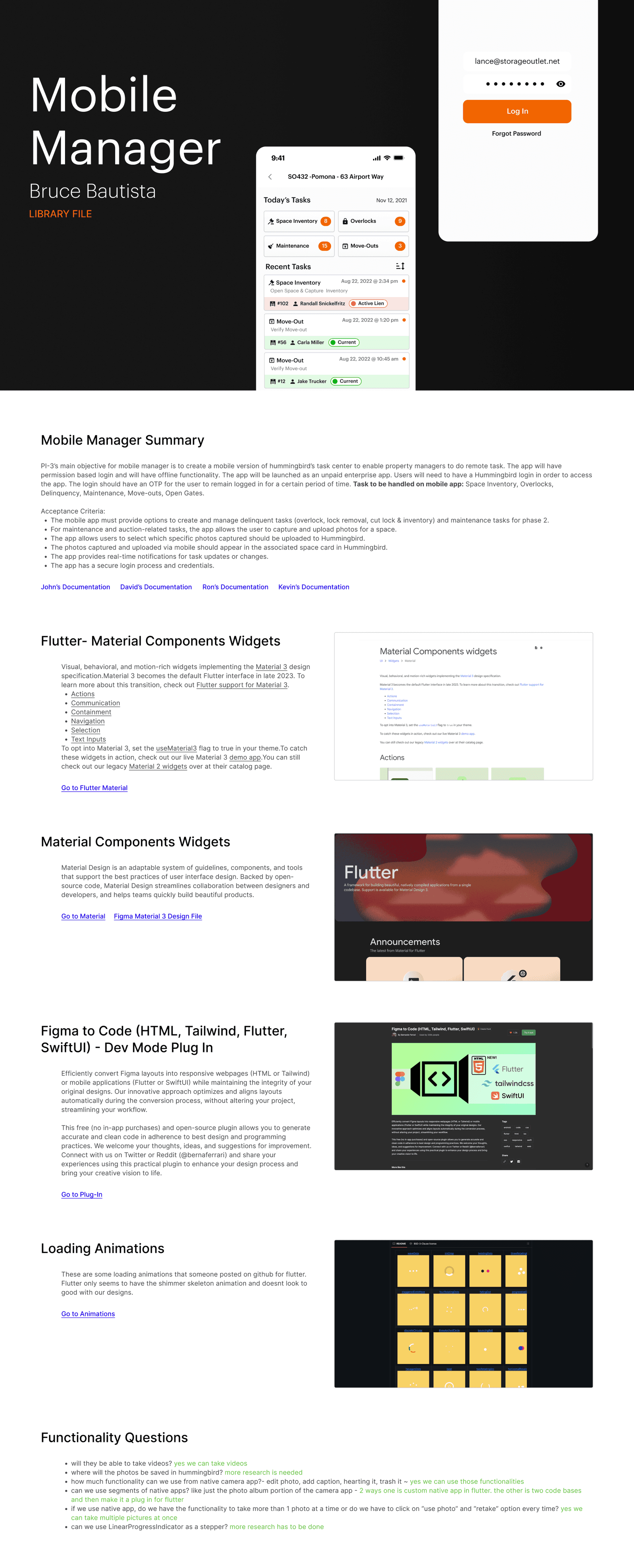
Project Summary
Our users often manage multiple properties, the app is built to cater to their frequent site to site travel and mobile task management needs.
This app supports the growing market trend where many self storage properties now have less managers on-site and more self-service features for their renters. The app enables managers to be more agile and efficient in completing their daily tasks.
200+ enterprise
Downloads first week
Lead designer
My role
Empowering your team to manage properties outside of the office
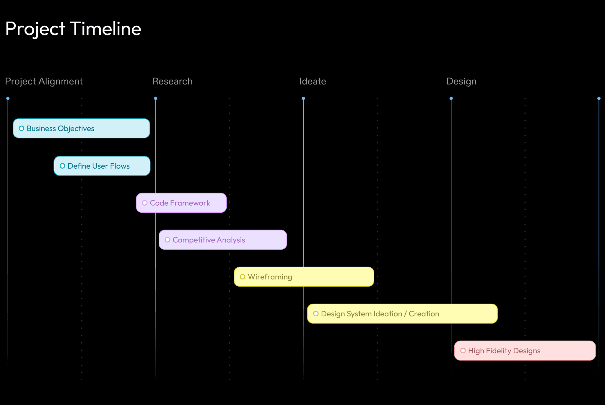
From Research To Market.
Business & Tech
Main objectives for the project:
Create a task management app specifically for tasks that must be done outside of the office (ex. Completing a maintenance task such as repairing a door)
Align the visual style of this new product to that of the company’s current design language and follow the company’s goals and principles.
Develop a scalable and agile design system.
User Pain Point
Solving the right problem for initial MVP release
We chose a specific, tedious task in the delinquency process that our users find frustrating to complete.
The tedious task: Managers must go through the storage unit of a renter who hasn’t paid their bill. Make a list of everything inside because the items might be sold at auction and upload it to auction website.
Pick up a clipboard, pen,
paper, & head outside
Go to renter's storage unit
and open the door
Take photos and write
down items
Walk back to
the office
Upload photos & list
to auction site
Beyond User Flows
The biggest challenge was the lack of corporate knowledge within the company for mobile design since the app was the first for Tenant Inc.
Problems such as picking a code framework, or choosing a way to distribute this product (As an enterprise app or through a marketplace like Apple or Google).
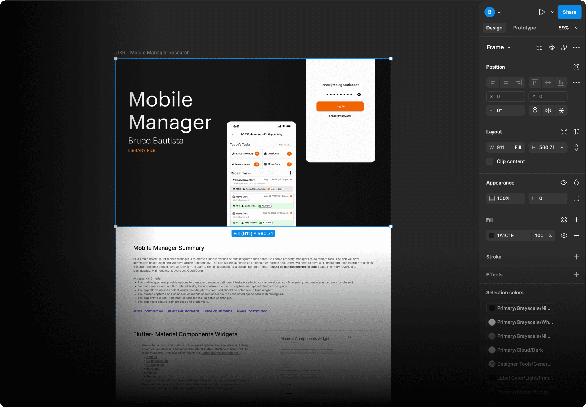
Research
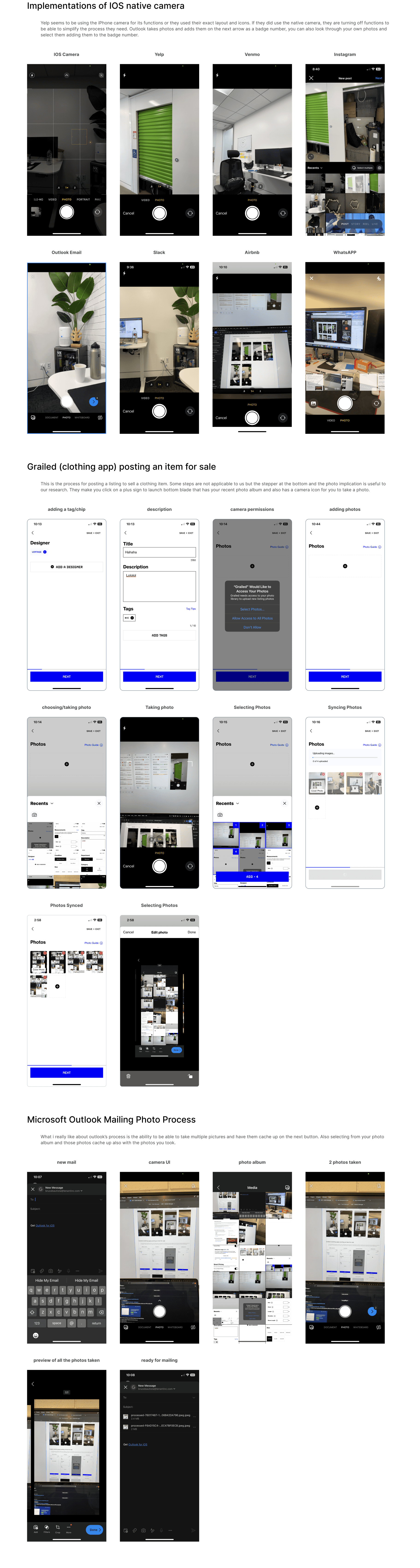
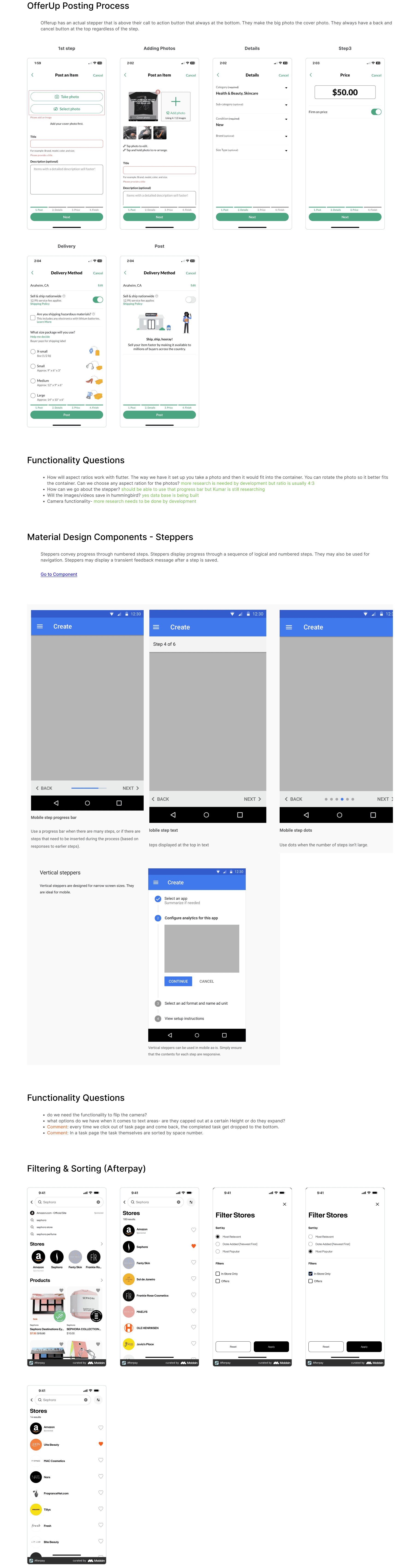
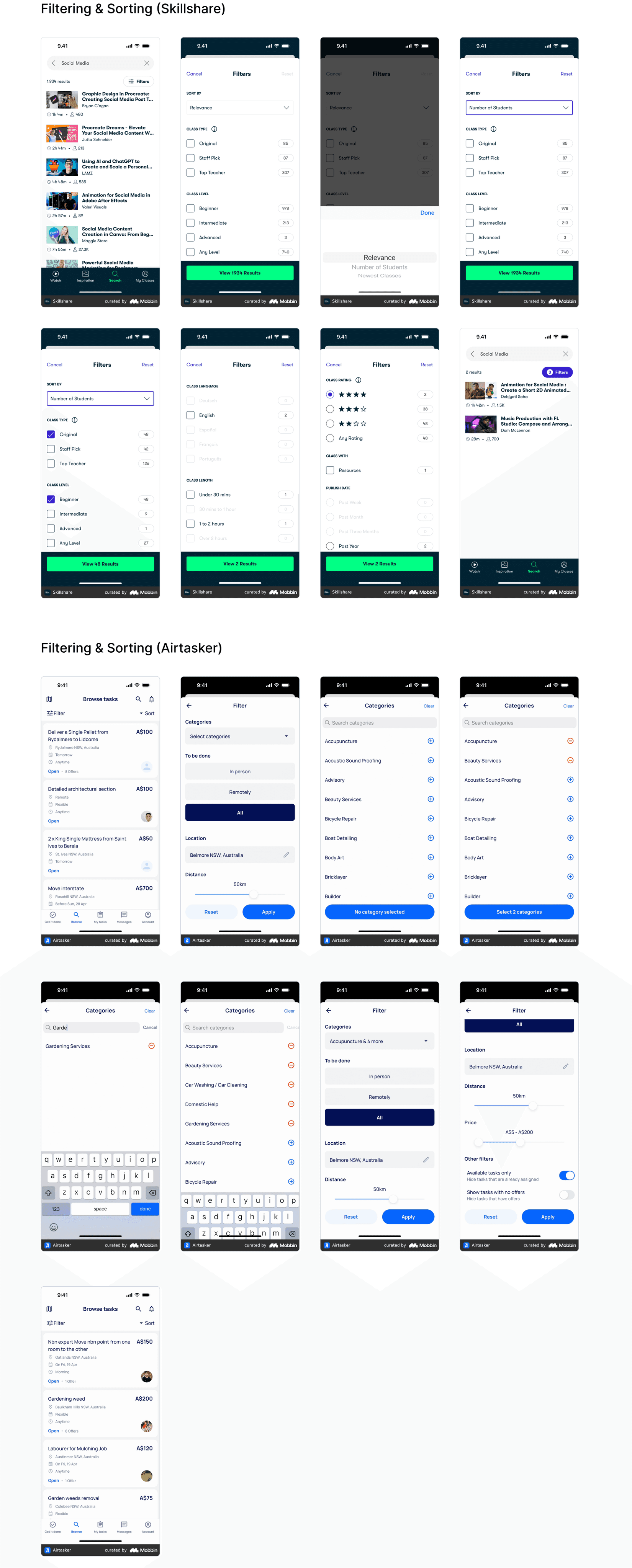
Competitive Analysis
I created and shared this Figma file as a document to organize myself for research purposes, it was a clear method for me to organize my thoughts and ideas. As shown in the file, I broke it down into sections:
• Summary of the project
• Resources with links
• Questions
• Research of competing applications
I made this accessible to other designers for them to use as a template for their research and documentation.
View Research Document
Design - Main Exploration
With the basic flows outlined, I started putting ideas on the page and started iterating
Using our current design system and Google’s material design, I began with the main functions. The app has two main screens: the task center and the task completion screen, each with its own features. By the end, I added designs to make the app more cohesive, including empty states, error handling, loading animations, & splash screen.


Completing Task
information gathering in one single step/screen

Completing Task
Image emphasis and online posting experience

Task Center
Initial concept using current design system components

Task Center
Exploring navigation and new possible components

Mini Tenant Profile
This serves as quick information for
the facility managers to reference
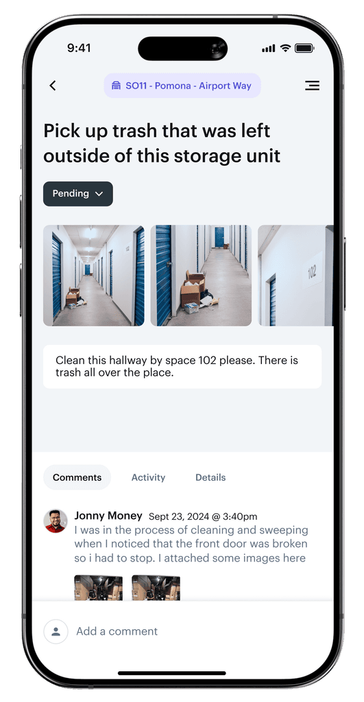
Task Status
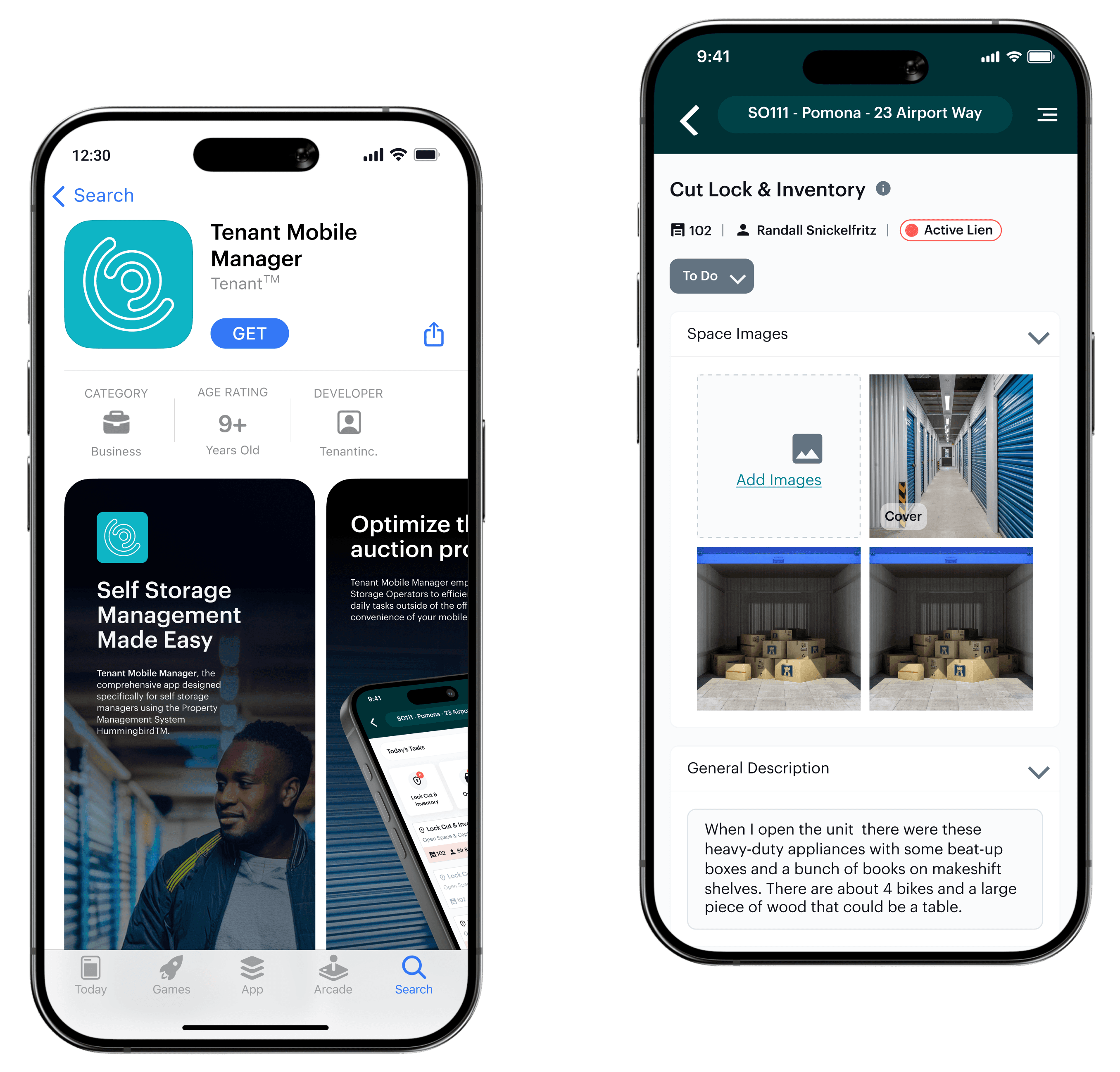
Managers can change the statuses of the task to complete, to-do, or archive. Managers can also view who assigned the task, created it, and who completed it.
Accordions
The accordion is where all the storage unit’s information would be inputted. Photos of the content inside, descriptions, and categories / keywords are all necessary to create an auction listing.
Desing - Final Designs
Completing A Task
I designed the task completion process to be quick and easy. When a user taps on a task, they see important details right away, like the tenant's name and unit number. Below that, I organized all the steps into dropdown menus, similar to our desktop version. To finish, the manager opens the "To Do" dropdown and marks the task as done.
Design - Final Designs
Task Center
This design works well because it's very similar to our desktop version. This means our users can quickly learn how to use it and finish tasks fast. This has to do with the fact that I kept the information hierarchy the same to what our users are familiar with.

Top Navigation
I used the same green header as we have in the desktop version to give the same experience to our users and know where to locate the current property.
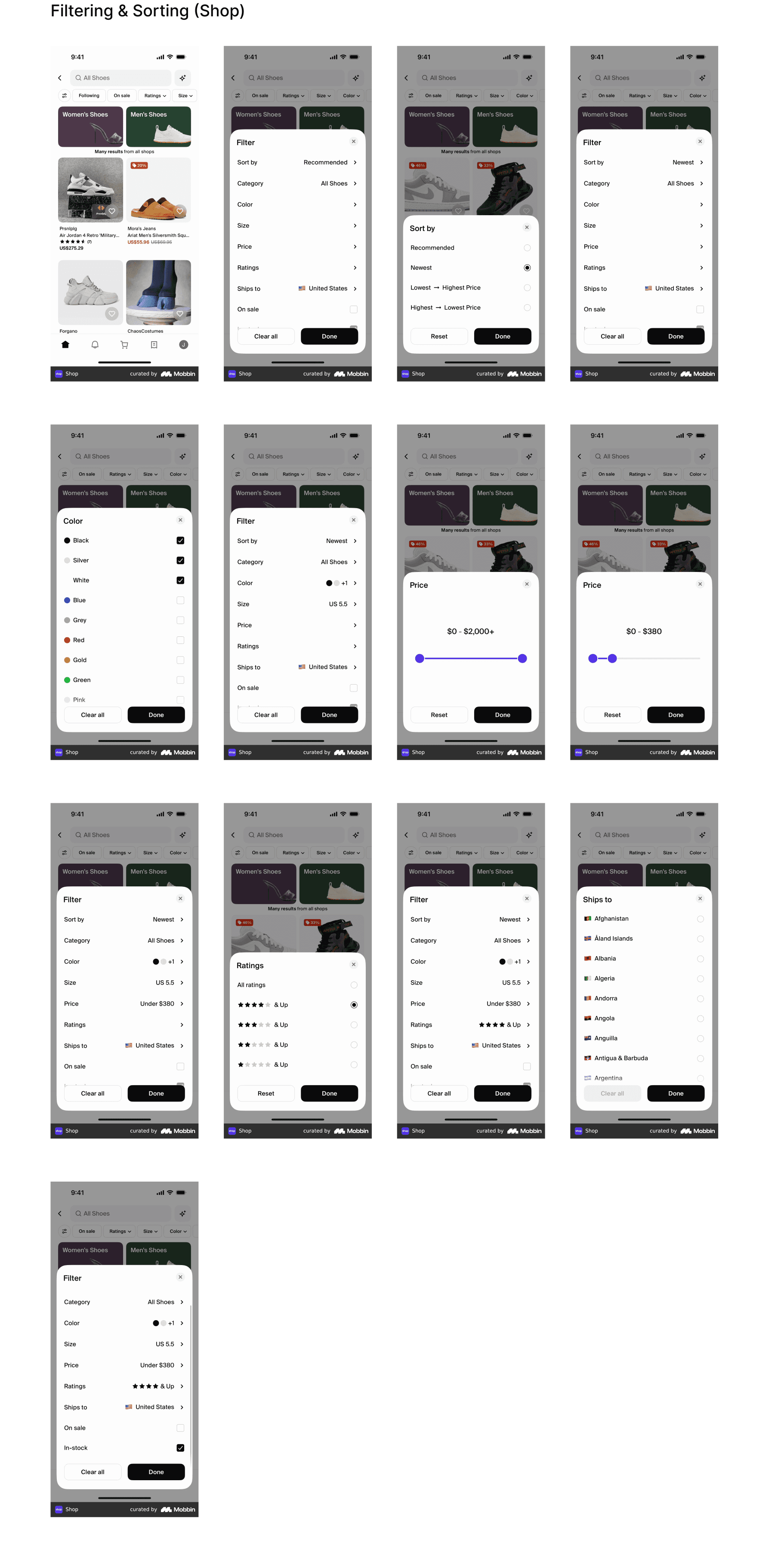
Filter & Sorting
Clicking on Today’s Task will give the user the option to view today’s, past due, and tomorrows tasks. The icon on the left can sort and filter by oldest or latest task and by task category.
Task Categories
Focused view of these type of tasks.
Task Cards
These cards follow our desktop email communication pattern with a title at the top, short description, and some important information about the tenant.
All Comes Together
By the end of development, we created a mobile design system and a strong foundation for growth.
Lastly, we just needed to submit our build to Apple to get it into the App Store before an important trade show.
Application
Design System


The Launch
The App Store
I created some visuals to help our audience understand the problem our app is solving and to convey its overall look and feel. We worked with Apple’s guidelines and got our app into the store right on time, ready for users to explore and complete their daily tasks.

Post Launch
After the release, I proposed a design direction to raise the design bar and better the native mobile UX experience.
Given we had to use some of our desktop design system to meet our deadline, I wanted to lean more into a true native UX experience with better mobile components and patterns.
Completing a Task
Clear hierarchy and better use of space & color
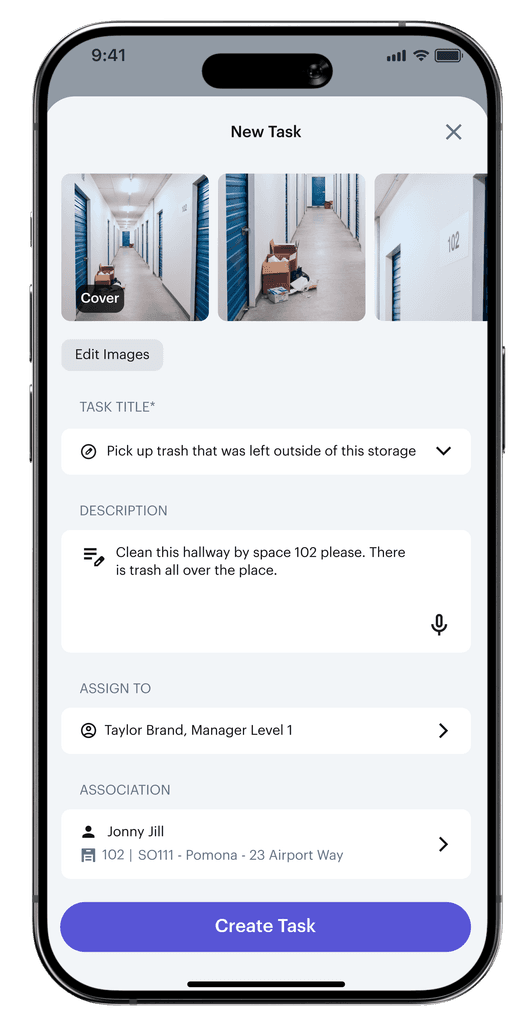
Creating a Task
Reduced cognitive load with a more scannable UI
Project Reflection
Given the tight timeline, we had to make some tough decisions during the app’s development. We chose to focus on one key workflow that provided the most value to our users, and to save time, we incorporated desktop design elements that did not aligned with native app best practices. In doing so, we had to leave out certain features, like task commenting and creating new tasks, to make sure we delivered a functional product within the time frame.
Ultimately I gained a deeper understanding of UX as it pertains to mobile design and bringing those efforts to market. Working closely with different departments sharpened my UX and Product mentality, while tying all this back to the company’s business goals.


